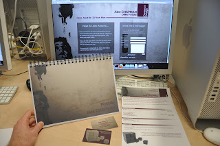
All of the pieces have come together and my personal branding is complete for now. I will continue to expand on this after University in the hopes of getting a career in this field. The images below show my website, portfolio, CV and business cards all in a group to show the branding theme.
The portfolio was made by printing on white card and mounting it to thicker black card. These pages were then wire bound. My main portfolio is my website, but the printed version is a nice addition.
I think this module has helped greatly in improving my personal branding designs and improved my confidence to sell myself a bit more effectively.
Web Gallery and Exhibition 2012
Tuesday 1 May 2012
Monday 30 April 2012
Exhibition Photos
The whole set of photos documenting the setup of the exhibition can be found on flickr at: http://www.flickr.com/photos/77805918@N02/
Friday 27 April 2012
Portfolio
For my physical portfolio hand-in, I will use my website as the source for my material. I will also include a few pieces that aren't on the site. I will rearrange the layout of the site and the images of my work to suit a landcape A4 format which intend to print onto black or white card and have them wire bound together. The portfolio will also include a short bit of information about me and what software I can use and each image will have a title and a very brief description of the work involved.
Also, after checking the website functionality, I've confirmed it also works on mobile devices for greater accessibility. This was tested on a mobile phone running the Android OS.
Also, after checking the website functionality, I've confirmed it also works on mobile devices for greater accessibility. This was tested on a mobile phone running the Android OS.
Wednesday 25 April 2012
A1 Board Evaluation
Now the boards are complete, I can see how they have turned out. First, the print quality is good and adequate for the exhibition, but has some vertical lines down the print. This may be due to the material that the baords were printed on. This was the cheapest option we had (at around £19 per board) which meant the image was printed straight to the board rather than being printed onto a vinyl sticker and then stuck to a board. There is not enough time to sort this issue before Monday. The print issue is not noticable at a medium distance so it is acceptable, but perhaps not good enough for the amount paid.
Another point made was that the text is perhaps too small. The text size had been scaled down quite a few times during the design process. This was due to a lot of people in the group refusing to cut down on the amount of text they were supplying. This resulted in smaller text than I had initially wanted.
The stripe lines up really well and creates a good flow across the boards giving them unity. Text is clear and legible over the background.
The logo from the print company does not suit the colour scheme. However, it was faded out and made small to provide as little distraction as possible. The reason we were stuck with the print company is because some members of the group were not happy paying for the more expensive, higher quality option.
Overall, while there are a few minor issues, I am satisfied with how the boards look and I think they will look good all together placed in the Mezzanine.
Tuesday 24 April 2012
A1 Boards
Earlier than expected, the printer has completed the job on the A1 boards. They have been collected and are now sitting safe in my apartment ready to be moved across to the Mezzanine when the exhibition begins. Bubble wrap and corner protectors were provided and they will be kept in this until the Monday of the exhibition.

It is a great relief to see these come out well after a lot of work. I am proud of these, I think they and everyone's work on them look good and I hope everyone else does too.
Also, the banner which was designed by Martyn (I think?) has been printed, is of very good quality and is suspended from the Mezzanine now.
As far as printing goes, we are just waiting on an A0 introductory board designed by Hong. This is with the printer and should be complete soon.
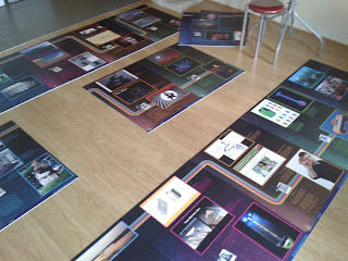
As they were intended to do, they flow nicely from one board to the next, held together by recurring patterns, colours and the stripe design.
Below is an image of my printed board next to a compressed version of the file it was printed from. The board looks a little washed out in this image, but I think that is down to the low quality camera used, although they are not as vivid as the file.

It is a great relief to see these come out well after a lot of work. I am proud of these, I think they and everyone's work on them look good and I hope everyone else does too.
Also, the banner which was designed by Martyn (I think?) has been printed, is of very good quality and is suspended from the Mezzanine now.
As far as printing goes, we are just waiting on an A0 introductory board designed by Hong. This is with the printer and should be complete soon.
Monday 23 April 2012
Printed Boards
Finally, after weeks of redesigns and heavy workloads, we have one board printed. Polly and myself went down to SignTec to have a look at the completed demo board today. The boards look very professionally printed, the text and imagery is very clear due to the good quality print and it has been printed on a strong, durable material that has a good feel. It is pleasing to see the effort I feel I have put into those A1 boards paid off.
The files that I had completed were 200dpi which I found to be a good size for large printing after some online research. However, the printer told us the files were good, but may have been too big in resolution . He said he could probably blow it up to 10 times the size and it would still look clear. A bit of overkill on my part then, but I am satisfied with the result and I think the group will be too.
The printers are going ahead with the job and all the boards and the banner are expected to be finished by Thursday (26th) and definitely before the weekend.
Monday 9 April 2012
Personal Website
My website is now online and can be found at:
www.alex-chapman.co.uk
Although there are a few bugs that need to be fixed with the site, the design and relevant information is there so it is acceptable to stay live. So far, I know that there is an issue with the background image in Google Chrome and the CV .pdf file doesn't download in Safari or Firefox. I will work on these issues as soon as possible when I have spare time. Ironically, the site works as it should in Internet Explorer, which is known for having the poorest compatibility of the main web browsers.
I have altered my downloadable CV file slightly in order to keep my personal information safe online. As anybody can access this information, I have removed my date of birth and contact details. If a client wishes to contact me, there is a functioning contact form built into the site.
The colour scheme and font styles are keeping in the theme of my personal branding.
Subscribe to:
Posts (Atom)


