Tuesday 1 May 2012

Ready for handing in

All of the pieces have come together and my personal branding is complete for now. I will continue to expand on this after University in the hopes of getting a career in this field. The images below show my website, portfolio, CV and business cards all in a group to show the branding theme.


The portfolio was made by printing on white card and mounting it to thicker black card. These pages were then wire bound. My main portfolio is my website, but the printed version is a nice addition.

I think this module has helped greatly in improving my personal branding designs and improved my confidence to sell myself a bit more effectively.

Monday 30 April 2012

Friday 27 April 2012

Portfolio

For my physical portfolio hand-in, I will use my website as the source for my material. I will also include a few pieces that aren't on the site. I will rearrange the layout of the site and the images of my work to suit a landcape A4 format which intend to print onto black or white card and have them wire bound together. The portfolio will also include a short bit of information about me and what software I can use and each image will have a title and a very brief description of the work involved.

Also, after checking the website functionality, I've confirmed it also works on mobile devices for greater accessibility. This was tested on a mobile phone running the Android OS.

Wednesday 25 April 2012

A1 Board Evaluation

Now the boards are complete, I can see how they have turned out. First, the print quality is good and adequate for the exhibition, but has some vertical lines down the print. This may be due to the material that the baords were printed on. This was the cheapest option we had (at around £19 per board) which meant the image was printed straight to the board rather than being printed onto a vinyl sticker and then stuck to a board. There is not enough time to sort this issue before Monday. The print issue is not noticable at a medium distance so it is acceptable, but perhaps not good enough for the amount paid.

Another point made was that the text is perhaps too small. The text size had been scaled down quite a few times during the design process. This was due to a lot of people in the group refusing to cut down on the amount of text they were supplying. This resulted in smaller text than I had initially wanted.

The stripe lines up really well and creates a good flow across the boards giving them unity. Text is clear and legible over the background.

The logo from the print company does not suit the colour scheme. However, it was faded out and made small to provide as little distraction as possible. The reason we were stuck with the print company is because some members of the group were not happy paying for the more expensive, higher quality option.

Overall, while there are a few minor issues, I am satisfied with how the boards look and I think they will look good all together placed in the Mezzanine.

Tuesday 24 April 2012

A1 Boards

Earlier than expected, the printer has completed the job on the A1 boards. They have been collected and are now sitting safe in my apartment ready to be moved across to the Mezzanine when the exhibition begins. Bubble wrap and corner protectors were provided and they will be kept in this until the Monday of the exhibition.


As they were intended to do, they flow nicely from one board to the next, held together by recurring patterns, colours and the stripe design.


Below is an image of my printed board next to a compressed version of the file it was printed from. The board looks a little washed out in this image, but I think that is down to the low quality camera used, although they are not as vivid as the file.


It is a great relief to see these come out well after a lot of work. I am proud of these, I think they and everyone's work on them look good and I hope everyone else does too.

Also, the banner which was designed by Martyn (I think?) has been printed, is of very good quality and is suspended from the Mezzanine now.


As far as printing goes, we are just waiting on an A0 introductory board designed by Hong. This is with the printer and should be complete soon.

Monday 23 April 2012

Printed Boards

Finally, after weeks of redesigns and heavy workloads, we have one board printed. Polly and myself went down to SignTec to have a look at the completed demo board today. The boards look very professionally printed, the text and imagery is very clear due to the good quality print and it has been printed on a strong, durable material that has a good feel. It is pleasing to see the effort I feel I have put into those A1 boards paid off.

The files that I had completed were 200dpi which I found to be a good size for large printing after some online research. However, the printer told us the files were good, but may have been too big in resolution . He said he could probably blow it up to 10 times the size and it would still look clear. A bit of overkill on my part then, but I am satisfied with the result and I think the group will be too.

The printers are going ahead with the job and all the boards and the banner are expected to be finished by Thursday (26th) and definitely before the weekend.

Monday 9 April 2012

Personal Website

My website is now online and can be found at:

www.alex-chapman.co.uk

Although there are a few bugs that need to be fixed with the site, the design and relevant information is there so it is acceptable to stay live. So far, I know that there is an issue with the background image in Google Chrome and the CV .pdf file doesn't download in Safari or Firefox. I will work on these issues as soon as possible when I have spare time. Ironically, the site works as it should in Internet Explorer, which is known for having the poorest compatibility of the main web browsers.

I have altered my downloadable CV file slightly in order to keep my personal information safe online. As anybody can access this information, I have removed my date of birth and contact details. If a client wishes to contact me, there is a functioning contact form built into the site.

The colour scheme and font styles are keeping in the theme of my personal branding.

CV

I have finished my CV which matches the same font set and purple colour scheme as the rest of my personal branding.

I am currently working on the finishing touches to my personal website which will be online soon. There is a direct download link in the footer of my site to download a digital copy of my CV. By making the CV into a .PDF format, there will be no issues with the downloader's computer not having the custom font installed.

My next blog post will be to mark the completion and upload of my personal website. Once that is done, I will work on my portfolio and finish off the work I am doing for the exhibition's graphics team.

Business Cards

My final design for my business cards has been sent to print using an online company.

Each image has a resolution of 300dpi and CYMK colour. There is a 3mm bleed around the edges and the final card size will be 85mm x 55mm which is the standard business card size for the UK.


The styling and colour scheme of the cards matches that of both my CV and website. I am yet to work on my portfolio, but it will also follow the style to keep everything looking like part of a set, creating a personal brand.

Monday 12 March 2012

Yet More A1 Boards

After more discussion and redesigns, it was clear the backgrounds on previous designs were too intricate and distracted from the student's work.

The new design has almost gone full circle and arrived back at a similar point to the first design I proposed. There have been alterations and it has been improved to a point. The background has coloured gradients to try and keep with the retro theme. We, as the graphics team, feel that the backgrounds are still distracting.


After changing the background design from one large image to a few smaller ones, we are happier with the background being less distracting, but having some form of design element. Here is an example of a complete board with the most recent and hopefully final design.


I will show this final design to the graphics team on Wednesday and have them give their opinions and do proof-reading etc so we have one board ready for a test print with the company the exhibition team has lined up as soon as we can.

Wednesday 29 February 2012

Leaflet Design

This design is primarily the work of Stephen Bewers. He designed these leaflets to be printed double-sided so we can hand them out to get people interested.

What we are trying to achieve is effective designs that are a collaboration of our work. This uses the background and logos created by Polly, the layout, wording and icons from Stephen, and designs from myself and Martyn.

What I have done below is mocked up a design using the finalised assets the whole group has decided to use across all of the work (A1 boards, posters, website etc) to keep them in tune with each other. This means the background, fonts and design bits are replaced, but the positioning and general arrangement stays the same.


More A1 Board Developments

After more discussions with the graphics group, and some input from people in other groups, this appears to be coming close to a final design. Once again, we are showing the image to as many people as possible in the whole exhibition to gauge opinions.

I prefer the darker design as it draws more attention to the work:


The text also stands out clearly.


A small number of people have commented how the design is slowly drifting away from a retro style which I do agree with. However, it is a group decision and this is where the process has led us so far.

It is still open to deliberation, but we are nearing a decision. We certainly need to soon as we need to produce 20 of these boards, test print them, then prepare them for the professional printing.


Tuesday 28 February 2012

New A1 Board Design

Using inspiration from the graphics team and their various pieces of work for the exhibition, I have created a new board design. Again, this is subject to change and needs to be discussed with the group still at this point in time. However, we will need to decide on a design style soon, so this is my input for this week.


This time, care has been taken with the layout paying particular attention to how people's work will be oriented. We need alternative designs to cater to people who want three landscape pieces, or other people who want a combination of landscape and portrait etc.

An idea came about early on with this theme to have 20 unique 8-bit character sprites on the design, one for each student showing work. This is only being used as another means to create a general theme across all the boards to make them look like they are from a set.

More attention has been given to the background, making it more of an 80's style, but with a futuristic twist. All of these designs are in very high quality so they are sure to look nice on the final printed boards. No matter what design we go with, the group knows the standards of print to make them good quality.

Tuesday 21 February 2012

Final Business Card

After a lot of tweaking, I like this design for my business cards. The cube now matches the same cut-out style of the text. Both sides have the same colours, fonts and texturing.


Unless I or anyone else notices some problems, I will most likely use this design and do a few print tests, then commit this as my final design.

More Business Card Ideas

Staying with the theme of purple, and staying in style with my website, I have redesigned my business cards again. I am happier with this layout for the information side of the card. The theme is there, the text is positioned nicely and more balanced than my last design. The relevant information is there and it is clear to read. The two corner borders just frame the design and make it look more complete.


As for the other side of the card, I like the text's cutaway effect, clarity and position. The background colour and texturing also works. I want to keep the cube as an integral part of the design as it symbolises my interest in 3D work, but I'm finding it difficult to find a position and opacity I am happy with. 

Having it in the left corner or centred are the only positions that work for this image. The design below has it with a high opacity which, to me, looks too "stuck on". It just doesn't blend well with the design.


I prefer the image taking up the whole background, and faded out a little more so it blends better.


And finally, a little colour correction on the cube layer blends it in with the purple a little better. This last image is my favourite, but I'm not quite sure it will be my final design yet. Perhaps a little work needs to be done to fade it in a bit more as the edges around the cubes are a bit bright.


And once again, these CMYK images don't look right on Blogger. The thumbnail view is fine, but the colours go way off when viewing full size.

Thursday 16 February 2012

Sound and Video

I am under the impression that if a student wishes to choose a sound or video as one of their submissions to the exhibition, an image is needed to represent the piece. I am thinking about submitting the character animation I am working on, so my idea was to have a simple icon over it. It would be large enough to show people it is not the actual piece.

For animations, a film strip overlay.
For any sound pieces, a speaker.
This way, it is clear what the work is, and that the viewer can go and watch / listen to it elsewhere depending on the final layout of the exhibition. The icon overlay would be identical for everyone's work to keep consistency.

Wednesday 15 February 2012

Business Card Idea

Here is a business card idea I have come up with. I have been working on designs for personal business cards before this module, so this is a little closer to a final design than I would normally be at by this stage. However, I am prepared to make adjustments.

The card is set to CMYK, 85 x 55mm at 300ppi for a high quality print. A 3mm bleed is recommended, but as I intend to do a test print at the Digital Copying Services on campus, I have no bleed as their pricing list states the image must be 85 x 55mm. I have been recommended to use PDF format. If the prints are not satisfactory, I will then edit the image to have a bleed and use one of the (more expensive) online companies I have researched into.

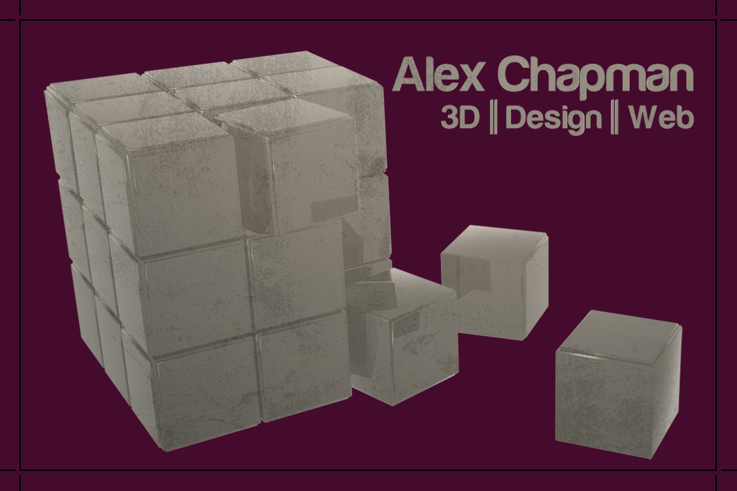
I would like a double-sided card and want it to convey my own style. I am interested in 3D work above all else (although I would like to freelance in web and Photoshopping to a lesser extent also) so I have opted to use one of my 3D models as a focal image. The collapsing metal cube is faded into the background while the text showing who I am and what I do is in the foreground, being key information.

A faded, double purple line separates the two lines of text. According to crystal-cure.com, purple is the colour most favoured by artists, is good to meditate to and if you surround yourself with purple you will have peace of mind. I feel this is a good reflection of my personality in just one colour as I think of myself as a calm and peaceful person. A deep purple like this has always been a colour I favour in design too.


The image below is the original HD render of my 3D model that I have used in this card design.


The reverse of the card is, again, simple and reiterates to the reader who I am, what I do and also how to contact me. The style is kept the same. This does seem a little empty or unbalanced to me, but I don't dislike it.


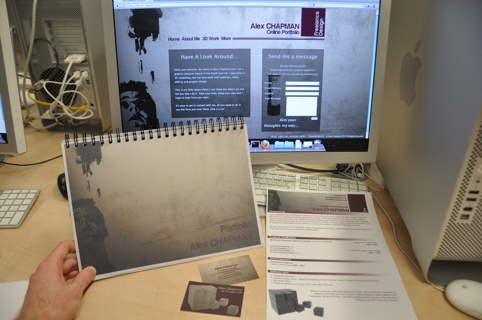
The grungy style of the card is intended so it matches the style of the website I've been building. After many redesigns of the website prior to this module, I have recently settled on this theme.

I intend to make layout changes and colour tweaks as I would like my website, business card and possibly CV to all have a similar style. For example, I would like the horizontal line to be the same purple as on the business cards. Some functionality such as the contact form also still needs work.


I currently have a functioning php gallery set up of my work on one of the tabs, so it is coming along nicely.

NOTE: Upon publishing this post and viewing my card images in full size, they look very...blue. I am hoping this is due to the image being set the CMYK but being displayed via an RGB screen. However, this is what the test prints are for. The two RGB images on this post (original cube render and website) display with the correct colours.

Tuesday 14 February 2012

Design Test

This is a design idea I came up with to showcase our work along the 80's theme. The ARU logo is clearly displayed at the bottom which I believe is a requirement (I will obtain a high resolution logo from marketing for the final product). There is a clear section for each student's profile image and text. The image is in the style of a polaroid.

The bright coloured stripe has been faded out to make it stand out less, as we do not want anything distracting from the actual work, but it is probably still too bright. This is a compromise that will need attention as we do not want anything too distracting, but the 80's is all about bright, neon colours.

Various icons from the time (this example shows Pacman) can be used to add more to the design. Having the stripe, and to a lesser extent, Pacman, going across the separate boards gives a sense of unity, and brings the whole exhibition together.


This is only an initial idea, and much more development and complete overhauls will more than likely go into this. This is also just my individual work and I would obviously like input from other members of the group to improve on this idea.

Saturday 11 February 2012

Mezzanine

Using the measurements a few of us took, found over on Stephen Davidson's blog, I have created a basic 3D model of the exhibition space. This way, we can visualise the layout in a quick and efficient way. For example, when we have the dimensions for banners and posters etc, we can check to make sure they all fit in properly.


This will also help us to see in a clear view how the place will look before moving everything in and arranging it then finding it won't work or an easily preventable problem happens. We can use this model to accurately make the most of the space we have.

Exhibition Profile Photos

I made a blog post a while ago about the photo editing that was required to adjust the photographs. My group and a few others I have spoken to about the photos agree that they did not turn out as well as we would hope. Using my photo as an example, it is clear that the lighting is not very good and has given it quite a yellow tinge. Too many shadows are cast on the face and the background was white.


Using some filters in Photoshop addressed some issues, but the overall opinion is that we would like better photos done.


Using the same filters on all of the photos produced a variety of effects which makes them not similar enough in style.


Also, being students in the field of design, I have heard a few people mention how they just look like bog-standard, school yearbook photos which is an opinion I agree with. This will be discussed and we will come up with suggestions on how to improve the overall style of these photos such as having unique backgrounds to each photo or a theme to stick to etc.

Test Design

Following ideas from the mood board, this is a quick test to show that it is possible and quite straightforward to replicate such a style.

In illustrator, a custom brush is made from different coloured squares.


Then, I cut three corners away from a rounded rectangle shape to make the path.


The custom made brush style was then applied to the path.


Once it is in Photoshop, it can be modified further. Using some graffiti brush styles, a grid image and blending techniques, I finished with this image. This is just a test so the layout and alternative colour schemes haven't been considered, but I am confident that with group effort this style can be used to its full potential.


Or, we could give it a 3D effect like this:


By doing all of this ourselves with software readily available, we can customise resolutions and layout perfectly to the requirements of any banners and prints we need.